Showing posts with label black and white. Show all posts

Friday, January 11, 2019

Welcome New Subscribers. Here's something on Black & White Landscapes

Can converting a color photo to black and white improve it?  What type of photos work better as black and white?  How is shooting for black and white different?

I've been writing this blog for several years.  Sometimes I write a new post almost weekly.  Other times, I'm not so diligent.  Recently there have been several new people subscribe to the blog and that has motivated me to try to do better.  Here's my first post of 2019.

Winter in East Tennessee can be challenging for nature/landscape photographers.  The trees are bare, there are no flowers. In fact, there is very little color to be found during the winter months.  When blessed with a nice snowfall we have abundant opportunities to make some beautiful photos of snow scenes, but that doesn't happen very often.  Except for sunrise rise and sunset, most days are grey and blah.

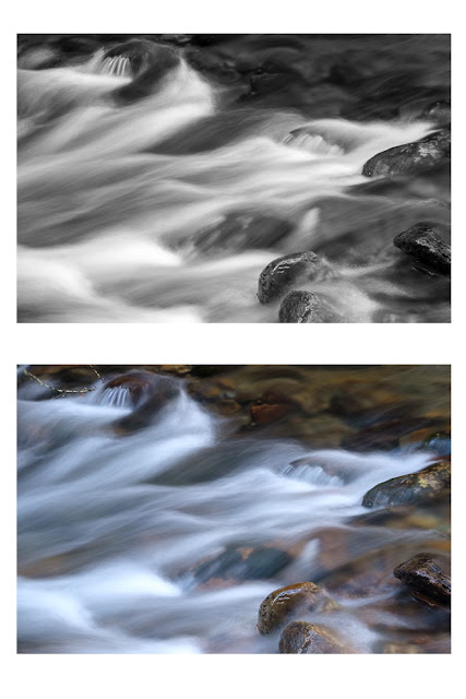
Some of the best color in the winter is around streams where moss grows on the rocks, like in this photo from Rocky Fork State Park.
Rocky Fork
Streams and waterfalls are some of my favorite subjects to photograph.  I try to capture the movement of the water using a longer exposure of around 1 second.  This can result in a photo with bright white water and darker surrounding objects.  I've found high contrast scenes like this can be dramatic when converted to black and white.
Converted to Black & White
When color is removed the composition and the tonal range of light in the photo become more important.  The tonal range of your landscape is basically the amount of highlights, darks, and every shade of grey in between. Highlights are your brightest whites, darks are your dark blacks.

When you are shooting a black and white photo, you should shoot in color and convert to black and white in post-processing.  That will give you the most control of the tonal values when editing the photo later.  If you shoot in black and white you will not be able to change the tonal values of different colors, such as making the green moss brighter in the example above.

You have to think differently when composing a black and white photo.  Without color, you’re dealing strictly with light tones now.  You should try to use that to your advantage when composing your shot. Instead of relying on color to separate your subject or draw the viewer's eye, look for light to create a dramatic photograph.  Shapes and lines can be important compositional elements in a black and white photo.  Often a high contrast photo will work great as a black and white.  Things such as texture become more important when color is removed.
Glacier National Park

The photo from Glacier National Park is one of my favorite black and white landscapes.  There is dramatic light, high tonal range, interesting clouds, and plenty of detailed texture in the trees and mountains.

Visualizing a scene in black and white is a skill that can take some time to develop.  Setting your camera to black and white can be a helpful tool when trying to visualize the black and white shot.  Just remember to take a color shot as well.

Below are a few examples from a recent trip to Rocky Fork State Park near Flag Pond, Tennessee. 


Making black and white photos can be fun.  Give it a try and let me know what you come up with.

Thursday, April 19, 2018

Don't Be Satisfied With The First

Many landscape photographers, including myself, have a bad habit of shooting the first obvious composition.  That's fine, but the problem comes when we stop there and don't take the time to look for other different less-obvious compositions.

1/4 sec, f/22, ISO 200, 41mm (cropped sensor)
Here's an example from a recent trip to Charleston Falls Preserve in Ohio.  The falls are billed as a miniature Niagra Falls because of the rock strata.  When we were there the water flow was low and the falls were nothing like Niagra, miniature or not.  There is a nice footbridge that crosses the creek below the falls.  This bridge is the obvious place to shoot from and I made all these photos from that bridge.  The best thing I can say about this first photo is it accurately depicts the falls.  It's what I call a documentary photo - accurate, but uninteresting.

The nice footbridge was also a barrier to getting to where I would like to have shot the falls - standing in the water about 20 feet from the base of the falls.  I could have positioned my camera low near the surface of the water and used the flowing water as a nice leading line up to the falls.  The day was cold, rainy and muddy - not worth climbing over the railing.

When the water falls vertically, a portrait (tall) aspect composition will often work best when shooting waterfalls.  That's how I shot the first example.  It shows the entire falls and the pool below.   Another option is to zoom in to capture some of the details in the scene.   In the second photo, I stood closer and used a horizontal crop to emphasize the three places where the water hits the rocks.

1/3 sec, f/11, ISO 200, 28mm
There is still a lot more rocks than water in the second photo.  I think the water hitting the rocks is the much more interesting than the rocks.   By zooming in even more I can emphasize the white water on the rocks. I also put a polarizer filter on my lens for this third photo.  The polarizer cut some of the glare off the wet rocks.
1/4 sec, f/11, ISO 200 66mm
My favorite part of this third photo is the flowing white water contrasting with the hard dark rocks.  The splashing water throws up a mist where it hits the rocks making it appear to glow.  Personally, I think this is a better composition than either of the first two.

When a photo is about contrast and shapes it can be a good candidate for black and white.  When you take away the color it can draw the viewers attention to other parts of the photo.  In this case that is the misty glowing water, the shapes or the water and rocks, and the contrast between the white water and the dark rocks.
The third photo converted to B&W
All of these photos were taken from the short footbridge.  By moving to different positions on the bridge and trying different compositions I was able to find multiple compositions I would have missed if I had stopped with the first.  When you arrive at a photo location, take time to look around.  You might try leaving your tripod and walking around with just your camera looking for interesting shots.  You can always go back for the tripod when you find a composition you like.  Just don't be satisfied with the first.

Tuesday, July 25, 2017

Power of Color in Black and White Photos

Black and white photography can produce some captivating and artistic photos. By removing color from the image you emphasize the tonality, geometric shapes, and composition of the photo. Of course, not all images work in black and white. A brilliant sunset loses its a beauty when all the color is removed. I find converting an image to black and white to be a fun creative challenge that can result in an image to be proud of.

Most digital cameras and even some cell phones can take photos in black and white. If you let your camera do the conversion to black and white it will store the image without the color information. You have now limited your ability to adjust the image later.  My suggestion is to always capture your images in color and convert to black and white in post processing.  Here's why.

The best way to explain what I am talking about is by showing an example.  The video below shows how powerful the color information is behind a black and white photo.


I hope that video is helpful.  Making videos is new for me and was a little intimidating.  I think I need some practice.

Here are some more examples of converting a color photo to black and white.

Sample Number One - Street Portrait

I made this photo of Carrington Kay at the Music On The Square in Jonesborough TN. I wasn't in a great position to make photos and was more interested in enjoying the music anyway. The musicians were in the shade but the background building was still in the sun. I edited the color version to deemphasize the background and focus on the two individuals, however, the red brick still grabs your attention more than I wanted it to.
Color
I used Lightroom to convert the image to black and white using the color sliders like I did in the video. The red brick wall no longer grabs the viewers attention allowing the musicians to be what your eye sees first.

Converted to BW in Lightroom
Click on the first image to zoom in then use the right and left arrow keys to flip through the different versions to see the differences in each.


Sample Number Two - Dull Sunrise

I said earlier that sunrises or sunsets are not typically what I would convert to black and white. In the example below the sunrise colors were very muted.  In fact, there is very little color in this image.
Fuji Provia Profile
When you shoot color in RAW format you can apply camera profiles later in Lightroom. In this example, I used a profile that simulates the Fuji Acros B&W film.  Applying this profile also changes the contrast and introduces simulated grain to make the digital image appear as if it was shot on Fuji Acros B&W film.

Fuji Acros Profile
By converting this image to B&W I removed the color distractions and emphasized the repeating patterns and composition. The surface of the water was blurred by using a 9-second exposure.

I really like the Acros profile and it's easy to apply in Lightroom.  If I don't like the result, it is easy to switch back to the default Provia color profile.

Sample Number Three- Timeless Scene

One more example of converting a color image to black and white.  In this case, the crisp color image appeared too new for the subject, which looked like it was set in the 1950s.  
Produce Stand in Color
 By converting to B&W the resulting image fits better with the subject.
Converted to BW in Lightroom
There are a number of ways to convert a color image to black and white.  I have shown you two ways in Lightroom. Other tools I use are Silver Efex Pro 2 from Google (Nik) and On1 Photo RAW.

Converted to BW in Silver Efex Pro 2 High Structure (Harsh) preset.


Converted to BW in On1 Photo RAW 2017 - Black & White Rugged Preset
These are just a few tools available for converting to B&W. There is an infinite number of ways to adjust an image when converting.  How you convert your photos is up to you. Use your creativity to express yourself and tell a story with your photos. Just make sure you capture the image in your camera, in color, preferably in RAW format.

Do you find these blog posts worth the time it takes to read them? Is there something you would like to see on the blog? Send me a note and give me some feedback.  I really do appreciate the feedback.

Saturday, July 25, 2015

Previsualization

The concept of previsualization in photography is where the photographer can see the final print before the image has been captured. Ansel Adams dedicates the beginning of his first book to previsualization, and is often quoted as saying “Visualization is the single most important factor in photography” - From Graham Clark Photography

I have been driving past this scene for years.  The tree has been there, slowly growing taller and fuller.  Many times I would wish I had my camera with me so I could capture the scene I had in my mind.  Today, June and I were heading that way and I remembered before getting too far from the house.

I really like minimalist photography where a photo will have a single subject with lots of empty space in the photo.  They are very simple photos that can be beautiful.   I imagined the photo with this tree on the top of the hill with lots of sky behind it being the empty space.  

When I made the shot today, the sky wasn't empty but had some pretty interesting clouds, which were not in my imaginary photo.   I took several shot from two different locations.  Some in portrait orientation and others in the landscape orientation.  In the end, I liked this composition best because I could use the clouds on the right to balance the tree on the left.  I cropped off much of the hill below the tree because it didn't really add that much to the photo.  This is a graphic image that seemed to me to be a good candidate for black and white.

Lone Tree
The end photo is not exactly what I had previsualized in my mind.   With the clouds in the background, it doesn't have the minimalist feel I was hoping for.  I still have something else in mind.  I'll just have to keep driving that road and remembering to bring my camera along for the ride.


Wednesday, February 25, 2015

Cades Cove Methodist Church - The Living and Enduring Word

I've been slacking.  I haven't written anything about the photos in my 2015 calendar yet this year.  And February is almost gone!   As I write this our third big snow storm of the month is rapidly approaching.  I think I'm ready for March and the promise of spring.

The photo for February was taken from the pulpit of the Cades Cove Methodist Church in the Smoky Mountains National Park.   John D. McCampbell, who was a carpenter and the pastor,  built the church building in 1902 in 115 days for $115.   How's that for a church building campaign?

The building featured two front doors, a common feature of architectural feature in the 1800s, which allowed men to enter and sit on one side of the chapel and women and children on the other.  In a move that may have raised some eyebrows at the time, the Cades Cove Methodist Church permitted its congregants to sit where they pleased instead of separating the men from the women..

The church was affected greatly by the Civil War.  Divisions among the congregation during both the war and Reconstruction resulted in a church split and the formation of the Hopewell Methodist Church, which not longer stands.

Today the Cades Cove Methodist Church is visited by hundreds of people every day.  We were there on a cold early Spring day and pretty much had the church to ourselves.   With no light other than what came in through the windows, the photos required a long exposure time.  However, those long exposures meant everything outside the windows was completely washed out.  I created a High Dynamic Range (HDR) photo by combining 7 different shots with exposures ranging from 0.4 seconds to 30 seconds.

I wanted the words in the Bible to be clear and even readable in the photo.   I also wanted the back of the church and the trees outside to be in focus.  To get that extreme depth of field I used a very small aperture of f/22.

All this photo needs is for the pews to be full of people in the clothes of hard working farmers from the early 20th century.  They might have been listening to a sermon on perishable vs. imperishable seed.   The Word was on that pulpit in 1902 and it's still there today.

The wide photo at the bottom of the calendar page for February is also from Cades Cove.  It was taken from the loop road looking across the cove to the mountains to the south.   You can't find a prettier place in the park.

Saturday, December 28, 2013

Evolution of a Composition

I haven't been out shooting much lately.  Winter in East Tennessee does not provide many opportunities for beautiful landscapes.  The colors are grey or muted brown.   It does not snow often and when it does I'm usually at work. 

Today was different.  I checked the weather forecast last night and saw that they were calling for 30% cloud cover at dawn.   You have to have some clouds to get a good colorful sunrise, but not so much that the sky becomes overcast.  Thirty percent sounded pretty good to me so I set the alarm. 

It was worth it!  Here's what June and I witnessed this morning.


Pretty special, huh?  

Afterwards we drove around a bit looking for other opportunities and found ourselves at the shore of Patrick Henry Lake.  I was hoping the sunrise would light up the fog on the lake but it didn't happen.  At June's suggestion I shot this.

 
I always listen to June's suggestions.   My photography is better when she is with me. 

The photo above is cropped and a little tone adjustments were added.    The colors are too blah but the contrast between the bare trees on the left and the fog is interesting.   When there is little color but interesting contrasts it's a good idea to convert to black and white and see how it comes out.

I think this is more interesting than the color version, but the real interesting part of this shot is the branch sticking out of the fog on the left side.   This was shot at 200mm.  I really needed to zoom in closer to isolate that section.  I could have gotten my 300 and 1.4 teleconverter to more than double to focal length but I was too lazy to walk back to the car. 

I decided to crop the photo to isolate what I thought was the interesting part.  The problem is this reduced my 21 megapixel original down to a 1.9 megapixel photo.  OK for a small version on facebook, but too small for anything else. 

I got a copy of Perfect Resize for Christmas.  Using that software I was able to enlarge it back to 16 megapixels, more than big enough for most anything I want to do with it.


This composition evolved from the original as shot, to a wide crop, to a black and white, to an extreme crop black and white.   I like the last one, but each one is different and conveys a different mood.

This has been a pretty good day for shooting.

Wednesday, March 27, 2013

Should I shoot my black and white in color?

Many digital cameras today will take photos in black and white.  Sounds like a neat time saving feature.  If I intend for a photo to be a black and white image, why not let the camera convert it to black and white for me and save an editing step later?   Like most things, taking a short cut now will cause problems later.

When the image that comes out of the camera in black and white, all you have is black and white.  All the color information has been lost.  You can't tell a red from a green or blue.  Why do you care if it's a black and white?  If you plan on doing any editing of the photo, you do care about the colors.   Here's an example to illustrate my point.

Here's a color image shown in Lightroom 4

Although it was still winter when I took this, there are some colors here.  Blue sky, red bricks, green roof, and just a little green grass.   Now, here's the same image converted to black and white in Lightroom.


By default Lightroom will create a black and white image that maximizes the distribution of grey tones. Notice how the color channel sliders on the right have been automatically set by Lightroom.   Most of the time I use this as a good starting point.  In this case, I want to make this photo a bit more dramatic.

I start by making the sky more dramatic by increasing the contrast between the dark (blue) areas and the light clouds.  Because the color information is still there in the photo I can easily do this by lowering the blue channel by grabbing that slider and pulling it to the left.


Notice the difference in the sky.  If I pulled the slider all the way to the left the sky would be almost black, which may be dramatic but it does not feel natural.

Second I want to lighten the front of the Salt House.  I do that by adjusting the Red, Orange and Yellow sliders until I get the effect I want.  I also want to darken the roof a bit.  Because the roof is green I can easily do that by pulling the green slider to the left.


Sometimes the color I want to adjust is not a pure color but a mixture of several colors.  Lightroom has a cool tool for adjusting specific colors in an image.  At the top left of the B&W panel on the right is a small target.  Clicking on the target activates the target adjustment.  Put your cursor in the place in the image that contains the color you want to adjust, left click and drag the mouse pointer up to brighten that color or down to darken it.  When you do this you will see more than one slider move and some sliders will move more than others.  Click Done to turn off the targeted adjustment mode.

In this example the locomotive is a bit dark and some details cannot be seen.  I'd like to lighten it up a bit.  Because black is the absence of color you can not use the color channels to make this adjustment.  The same is true for white, which is all colors blended together.   The best way to adjust these is to adjust the region of the tone curve using the tone curve or tone sliders or to use the adjustment brush.

If I was working with a straight black and white image right out of the camera with no color information it would be difficult to impossible to make these adjustments. That's why you should always shoot in color and then convert to black and white later on the computer.

I used Lightroom for this example but it works the same in other photo editing packages, including Photoshop and Nik Silver Efex (now part of Google).

Remember, don't take short cuts when you capture an image.   It may sound like a good time saving step but you may not be able to get the end result you want if you short cut.  The same rule applies for good composition, exposure, and technique when taking a photo.  Get it right in camera without short cuts.

Monday, January 14, 2013

You Can't Always Get What You Want....

Saturday evening we were in Pigeon Forge for Wilderness Wildlife Week and had a little time to kill before meeting some friends for dinner.   The sky was starting to look a little interesting and there was a chance for a cool sunset.   The problem was I didn't know any places close by with a clear view of the west without the billboards, neon lights, The Titanic, or King Kong in the way.   The best chance to get the photos I wanted was Wears Valley.

We took some back roads to try and get up above the valley for a view of the sunset but didn't find anything we could get to from the road.   Time was running out and the sun waits for no one.

We had driven past this little white church right on Wears Valley Road many times over the years and always said we should stop and explore a bit.   The the sunset was turning into a bust as we drove on to Headrick Chapel.  According to wikipedia

"For most of the 19th century, funerals in Wears Valley were held at Headrick Cemetery, near the valley's western entrance. A large oak tree provided shelter for funeral-goers, although cold weather and rain often made apparent the need for a building in which to conduct indoor services. In 1902, according to local lore, the oak tree was destroyed by lightning, and in response, the residents erected Headrick Chapel on the cemetery's grounds. The chapel was shared by four Baptist and Methodist congregations, with funeral services having priority. The chapel's bell would ring once for every year of the deceased's life, a tradition still observed by the inhabitants of Wears Valley. In 2001, Headrick Chapel was placed on the National Register of Historic Places."

When we arrived I got my tripod out and started to set up when I realized I had forgotten the quick release plate needed to attach my camera to my tripod.   I always shoot on a tripod and now not only was there no sunset color in the sky I didn't have the equipment I thought I needed.  Things weren't turning out according to my plan.


We wandered around for a little while and took a few shots.  I even tried shooting through the dirty windows.  When we left for dinner I really didn't think I had anything worth keeping.   When we got home Sunday afternoon I discovered there were one or two that while not good enough to print, they were good enough to share.

Because there was little color in the sky or the flora and the chapel was basically white the images seemed to work best as back and white.  Some people don't like black and white.  Here's a color version for you.

I think there are a lot of cases where a monochrome image is a better choice than color.     Do you prefer color or black and white?

I didn't get the photos I thought I wanted but I had fun and learned a little about the Headrick Chapel in the process.   I have to keep reminding myself that God has places the photos out there for me to find, but it's his plan and not mine that will lead me there and I will find what I need.   I have to be open to plans that aren't mine.

"You can't always get what you want
But if you try sometimes you just might find
You get what you need
"

  Mick Jagger

Monday, August 6, 2012

The New Old Stuff

I continue to go back and pick out photos from past years to see how they might look different with new editing tools. It's kind of fun to compare the old versions to the new versions. Here's some old and new comparisions of an old photo of old stuff.
First - this is how the photo came out of the camera with no processing at all. I shoot in RAW format, which means the camera does no processing of the image. By default digital cameras adjust the contrast, color, sharpness and other things before you ever see the image. This image suffered from being shot through dirty window glass which cut down the contrast and details.
Second this is the result of my editing a little over two years ago. Now when I look at this I think BLAH!
Finally, here's what I came up with tonight. I used Nik Color Efex 4 to pull some of the details out and bump up the contrast. I then used Nik Silver Efex 2 to create this black & white with the color of the rusty parts showing through and add a boarder. I'm not a big fan of selective colorization in B&W, but in this case it seemed to work OK. What do you think? Which do you prefer? If you click on one of the images you will be able to flip back and forth to compare. The second image is probably more realistic but the third seems to be more interesting.

"Surely you heard of him and were taught in him in accordance with the truth that is in Jesus. You were taught, with regard to your former way of life, to put off your old self, which is being corrupted by its deceitful desires; to be made new in the attitude of your minds; and to put on the new self, created to be like God in true righteousness and holiness." - Ephesians 4:21-24 We are called to be made new and put on a new self. This is an inner throwing off of old ways and becoming more Christ like. Our old bodies may be dressed up to look new or at least more interesting like this old bottle, but it's the inner self that is important. Let's work on the inside.