Friday, December 23, 2016

Make Your Christmas Lights Bigger

I was playing around with a candle and Christmas lights today and came up with a series of photos that demonstrate how different aperture settings change how lights in the background appear.  

Here's a little refresher on aperture.   The aperture is the opening in the lens that lets light pass into the camera.   The bigger the aperture, the more light gets to the camera sensor.   The aperture also changes the depth of field or how much of the photo is in focus from near to far.   A larger aperture (smaller f-stop number) creates a small depth of field, making things in the background out of focus.


Here is a series of photos where I changed the aperture when making the same shot.

f/2.4
f/3.2
f/4.5
f/5.6
As you can see I started with a pretty wide aperture (lower f-stop number is a wider aperture or opening in the lens).   A wider aperture makes things in the background more out of focus.  In this case, it makes the Christmas tree lights in the background appear to be larger.  As I increased the f-stop, making the aperture smaller, the lights became more in focus, appearing smaller relative to the candle in the foreground.

The photo below was taken at f/14.
f/14
Notice the lights no longer appear round but look like octagons.  This is because, at smaller apertures, they begin to take on the shape of the aperture opening, such as the medium aperture in the diagram above.  The quality of the out of focus lights is dependent on the number of blades in the aperture.

I thought this was pretty cool and I wanted to share with others.   Now, go give it a try.

Thursday, December 22, 2016

I just bought a piece of photography equipment I have said is unnecessary

Like all hobbies, there is an abundance of gadgets, gizmos, do-dads, and other accessories that are available to photographers.   Over the years, I have succumbed to the Photographers GAS - Gear Acquisition Syndrome.  I have two cameras, 9 lenses, multiple filters, two tripods, and several different camera bags to lug all that gear around.   I have a closet at home dedicated to my camera gear.

There is one item I have maintained is unnecessary and up to this week, I didn't own one.   A UV
UV Filter
 filter is basically a piece of clear glass that goes on the end of a lens.  As its name implies, it blocks UV rays from entering the lens.  In the old days when photographers used film that was sensitive to UV rays, the UV filter could keep photos from having a nasty blue tint.   Today's digital cameras are not impacted by UV rays.   Having a UV filter to block UV rays is a waste of time and money.

Any time you add more glass to a lens you risk degrading the quality of your images.   Like a chain with a weak link, a lens is only as good as its worst piece of glass.  Put a cheap UV filter on an expensive lens and you may get poor quality images, especially when shooting into the sun or other bright light sources.

The one reason I hear most often for using a UV filter is to protect the front element (glass) on the lens.   If the UV filter gets scratched you can replace it.  If the front element of a lens is scratched you are looking at an expensive repair.

This brings me to why I bought a UV filter.   I'm going to be shooting in deserts in Nevada and California in a few weeks.   There is a possibility of blowing sand, which can ruin glass on a lens.   I will bring the UV filter with me and if the conditions are such that I need that additional protection, I'll use it.  

One piece of equipment I tend to use almost all the time is a lens hood.  While it may not protect
Lens Hood

from flying sand, it can protect the front of the lens from other objects, such as tree branches, rock outcroppings, and other dangerous objects found along hiking trails.   The hood is primarily designed to block light from hitting the front element of the lens, which can cause flares in an image.   It is also useful as a shield in the woods where June and I spend a lot of time.

As I said earlier, I have a lot of other gear.   I'll review some of that in future posts.

Watch for desert photos in a few weeks.


Thursday, December 1, 2016

Two New Photography Classes Scheduled

I will be teaching two classes this winter.

Moving from Beginner to an Accomplished Photographer
Adobe Lightroom for Photographers


Monday, October 31, 2016

Iceland Photo Adventure - I can highly recommend this trip.


This past March, June and I spent a little over a week in Iceland with a group of photographer friends.  The trip was put together by John "Snake" Barrett.   John and Jim Begley are putting this trip on again as an official workshop.   If you ever thought about going on an Iceland photography adventure, this is a trip I can highly recommend.


John is a great organizer and will make sure your trip is as fantastic as possible.   We stayed in some fun eclectic places, including a dairy farm, an old school, and a hotel at the base of a volcano.   We hit the spots at the best times and John was always looking for quick adjustments to improve our chances of making some great photos.   Here's his website http://www.johnbarrettphotography.com/

Jim is one of the best photographers and teachers I know.   Check out his website http://www.wowphotoshdr.com/

Don't just take my word for it.  You can see the results of my trip in my Iceland Gallery.
http://www.thesiggins.com/My-Gallery/Travel-1/Iceland-

If you're interested, contact John and Jim at Info@JBPhotoTours.com.

Sunday, October 23, 2016

Product Review - Sleeklens Presets and Brushes for Lightroom

I was recently given an opportunity to review a set of develop presets and adjustment brushes designed for use in Adobe Lightroom.   The folks at sleeklens package their presets and brushes into what they call workflows.  The workflow I reviewed was "Through The Woods".

Sleeklens provides a series of video tutorials on how to use the Through The Woods workflow.  You can view those here - https://sleeklens.com/product/landscape-lightroom-presets/

What makes these different from the million and one other presets available?  The biggest difference is these are designed to be used in a workflow.  Presets are applied from global to more targeted changes.  Then the brushes are used for changes to specific areas of an image.   These all work together in a consistent fashion.

They are also stackable - each preset only changes specific settings for the named effect without changing other develop settings.   This allows you to apply multiple presets to a photo.

To evaluate the presets and brushes I picked a few images from a recent trip and edited them.  Here are the results.

If you click an image you will be able to view it larger and use the arrow keys to walk through each step.

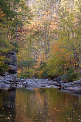
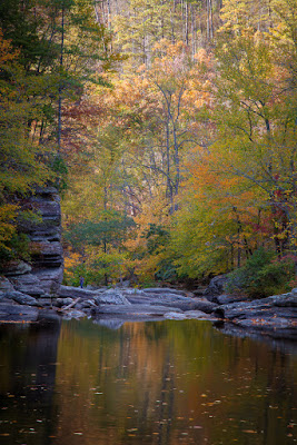
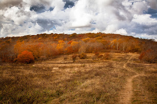
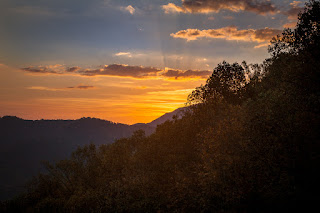
Step 1 - Unedited RAW image from a Canon 5D Mark II, 24-105mm @105mm, f/14, 0.5 second, ISO 100.
Unedited Raw Image


Step 2 - All In One - Shine Into the Sunset preset applied.
Shine Into the Sunset Preset
In one click this preset changed contrast, highlights, shadows, whites, blacks, clarity, vibrance, overall saturation, orange saturation, shadows toning, sharpening, and noise reduction.  This is definitely a nice improvement applied in just one click.

This brings up one issue I have with presets in general.  This preset made these detail changes

That's more sharpening than I typically use.  I applied the preset to multiple photos from different cameras at high and low ISO settings. In each case, the sharpening and noise reduction were the same, which may not be appropriate for all photos. When I applied the preset to an image taken on a Fuji XT-1 at ISO 1000 the level of noise introduced was not acceptable for me.   I would have to reduce the sharpening and increase the noise reduction on that image. You have to be careful with any presets to make sure they aren't making changes you don't want.

Step 3 - Base - Autumn Colors.  This preset made changes to the Hue, Saturation, and Luminance sliders to emphasize the warm colors.  It also changed the Split Toning, overwriting those changes that were done in step 2.
Base - Color - Autumn Colors Preset
I really didn't care for the color in this step.  I hit control-z to undo that preset.

Step 4 - Because the All In One and Base presets were changing too many things at once, I stepped into the Exposure presets.  Applying the Exposure - Less Highlights changed the Tone Curve to reduce the Highlights and Lights. I like what this did for the brighter areas at the top of the image.

Exposure - Less Highlights
Step 5 - Making it Pop!   I wanted to bring out the autumn colors and make them really pop. Clicking the Warm It Up preset didn't do what I expected.  Instead, it changed the Split Toning and made the image less warm. I backed this change out.

I then tried Polish - Punch It Up, which bumped up the Vibrance and Saturation.  It also reduced the Clarity, which I didn't expect.  I did like the effect and decided to keep it.

Step 6 - Vignette.  I almost always apply a gentle dark vignette to my photos.  I tried the Vignette - Medium Black and Vignette - Subtle Black presets and decided on something in between.   I manually adjusted the Amount on the Post-Crop Vignetting to split the difference.


Punch It Up and Dark Vignette Applied
At this point, I decided the image looked pretty good and was where I wanted the image as far as presets.   Time to try out the adjustment brushes.

Step 7 - Adjustment Brushes.  Adjustment Brushes are one of the most powerful tools in Lightroom and one I use often.  Lightroom comes with a handful.  Sleeklens adds several more.  I applied the following brushes:

  • Reduce Highlights to the upper center where the forest was still a little bright.  This didn't go far enough so I dropped the exposure setting on the brush a little.
  • Intense Sunlight to some of the trees where the leaves had started turning golden.   This brush warmed the color (temp), brightened the highlights, bumped the saturation and applied an orange color.  This was a bit too intense for me so I reduced the saturation of the orange color.
  • Subtle Sunset Haze - I applied this to some of the trees to reduce the contrast, bump up the highlights, shadows, clarity, and saturation, and apply a light orange color.  This is a more appropriate brush for this image.

There are many other brushes that I tried, but these three were all that I felt I needed on this image.   Here's the final result.
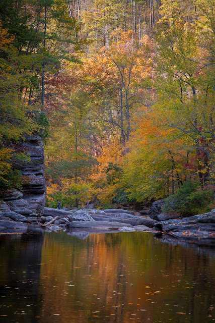
Final

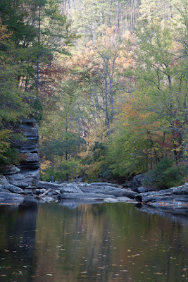
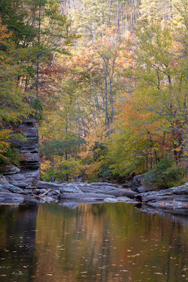
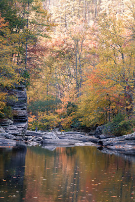
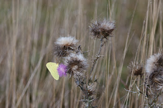
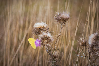
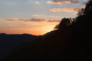
That's just one example.  Here are some before/after images


Before
After


Before

After


Before


After


OK, if you have read this far you are looking for the bottom line.   Everything that I did with the sleeklens presets and brushes could have been done manually.   As a long time Lightroom user I can zip through post processing pretty fast and typically don't use presets.   I do use brushes and having the sleeklens brushes will improve my productivity and creativity.

If I was new to Lightroom and didn't know how to manipulate all the myriad of adjustments to get a particular desired effect then the presets would be useful.  They are short-cuts.  Short-cuts will get you to somewhere faster, but may not get you what you want in the end.  Even beginners should not rely on presets entirely.

All the sleeklens workflows, including Through The Woods, sell for $39 each.  They also offer money saving bundles.   Is it worth it?   That's a tough call for me. An experienced Lightroom user may not find the workflows save them much time.  Casual and beginner Lightroom users will probably find the workflows to be a great boost to their productivity and creativity.

There are many free presets that can be downloaded and installed at no cost.  Just google "free lightroom presets" or "free lightroom brushes" and you will be presented with more options than you know what to do with.  Why would you pay $39 for a set when you can find others for free?  By purchasing the sleeklens presets you get a set of tools that work together well.  The free stuff, maybe not so much.

Finally, I want to say that sleeklens provided a free copy of the Through The Woods workflow in return for an honest review.  I have not been influenced by sleeklens and have given my honest opinion here.

I welcome questions.  Just drop me a note on the Contact Me page on my main gallery - http://www.thesiggins.com/


Sunday, October 2, 2016

The People Have Spoken! Finalists For My 2017 Calendar

The results are in.   I can now tell you which 14 photos made the cut and will be on the 2017 calendar.

First Place - Northern Lights

The Winners - Top 14

Place Title Votes
1 Northern Lights 34
2 Milky Way 32
3 Sunset and Layers 30
4 America! 27
5 Beam Me Up 26
6 Crabtree Falls 25
6 Red 25
6 Snow Covered Reflections 25
6 Sunset on Fort Patrick Henry Lake 25
10 View from Roan Mountain 24
11 Fall In The Smokies 23
12 Little Church in The Cove 22
12 Rolling Fall Color 22
14 Appalachian Trail 21


The Others

Place Title Votes
15 Angry Seas 19
16 Bleeding Hearts 18
16 Tree Ornaments 18
18 Mountain Bluff Reflections 17
19 Standing Firm 16
19 String of Pearls 16
21 Cool Mountain Stream 15
21 Fall Sunset 15
21 Waves of Grass 15
24 Foggy Morning 13
24 Tennessee Barn 13
26 Fall Kayak Trip 12
26 Rhododendrons 12
26 Tulips 12
29 Bloom From The Backside 10
29 High Surf in Iceland 10
29 Ice Lagoon 10
32 Linville River, NC 9
32 Pink Dogwood Blooms 9
34 Clematis in Bloom 8
34 Wild Columbine 8
36 Fall Reflections 7
37 Focus 6
You can view the photos in order by going to http://www.thesiggins.com/SpecialProjects/2017-Calendar-Candidates/ 

Every year I am surprised by which photos you like and the ones that fall to the bottom list.   I really shouldn't be all that surprised because I learn the same things each year.
  • This is the first year I have included night sky photos and they were very popular, placing first and second.
  • Landscapes are the most popular.
  • People don't want to see a flower photo on their calendar for an entire month.  They really don't want to see a big bee on a flower.
  • Photos that were taken in this region tend to do better than those taken elsewhere.

What surprises did you see in the results?  

I've started the process of laying out the calendar.   I'm going to change up the style just a little bit this year.  I think you'll like the results.   

I'll be ordering the calendars from the printer in a couple weeks. My goal is to run out just before Christmas and that has worked out every year so far.  It helps if I have a good idea of how many will be needed.  

If you would like to order one or more calendars:

  1. Send me an email letting me know how many you want.
  2. I'll send you an email with info on how to pay for them.  They are $15 each, plus $3 shipping if I mail them to you.  Free personal delivery if you live in the Kingsport area. 
  3. I'll be delivering the calendars during November and December.


Calendars make great Christmas gifts for the people on your list who have everything.   They can be great gifts for your business clients as well.  Buy from me, support a great ministry and avoid the crowds at the big box stores.

Thanks to the 47 people who voted this year.  You really make my job easier and the calendar better.   If I had picked you might have seen photos from the bottom of the list on the 2017 calendar.


Wednesday, September 28, 2016

No Debate About It - Only three more days to vote!

Time is running out on voting for the favorite photos on my 2017 calendar.  The deadline is midnight, Friday, September 30.

So far 39 people have voted.  Here are some hints on how things are coming out.
Will this photo make the cut?


  • The first and second place photos have been within one vote of each other for a while.  
  • There are several ties, which means your vote really counts!
    • Three in fourth place
    • Three in seventh
    • Two in eleventh
    • Two in fourteenth
    • plus several others
  • I was hoping that America! ( Navy Seal Parachutist) would be in the top 14 so I can use it for July.   No problem there as that one is currently in fourth place.
  • There are no flowers in the top 14.  The closest is in 22nd place.  If you want to see flowers on the 2017 calendar, better get your votes in.
In case you missed it, here's how to vote - http://thesiggins.blogspot.com/2016/09/its-time-for-you-to-vote.html

I will be starting the process of putting the calendar together this weekend.  Once that starts, it will be too late to vote, but not too late to order.  Remember, ordering is easy -- just send me an email at rcsiggins@gmail.com and let me know how many you want.

Friday, September 23, 2016

Early Voting Results

It's only been two days and I've already received about half as many ballots as I did last year.  We're
well on the way to selecting the photos for the 2017 calendar!  Just as the media will do on November 8, I'm going to give you early reports on how the voting is progressing.

Voting Has Started


  • There are 37 candidate photos.
  • I've received ballots from 23 people so far.
  • Every photo has received a vote, but the last place photo has only received 2! It's not looking good for number 37.
  • The first place photo was voted for by 70% of the people voting so far.
  • June and I only had one big trip this year and that was to Iceland.  Three out of six photos from Iceland are in the running, including the first place photo.
  • Ten of the top 13 photos were taken within 100 miles from home.   One was taken in my own backyard.  Last year, two winners were taken from my backyard.   Just goes to show you don't have to travel far to make nice photographs.


Want to know which photo is in the lead right now?   Click here to find out.

Voting will continue one more week until Friday, September 30.   We sure to get your vote in so you can help pick the photos for the 2017 calendar.


Thursday, September 22, 2016

It's Time For You To Vote!

It's Time For You To Vote!

No, it's not November 8th just yet.   However, it is time for you to help pick the photos to go on my 2017 wall calendar.  Each year I invite anyone who has bought one of my calendars in the past or intends to buy one this year to help select the 14 photos to be included in the next year's calendar.  It's time for you to start the voting for the 2017 calendar photos.


Will one of these photos make the 2017 edition?
Appalachian Trail
Northern Lights
Crabtree Falls
The fun part is you get to help pick the 14 photos (12 months, plus the front and back covers).  In the past, I have picked some of my favorites before letting you vote on the rest.  This year I'm leaving it wide open and you get to vote on all of them.

The candidate photos are available online at
http://www.thesiggins.com/SpecialProjects/2017-Calendar-Candidates/

These were all taken in the past 12 months and include photos from Tennessee, North Carolina, South Carolina, Florida, Michigan and Iceland.  The best way to browse through the photos is to click on the first small thumbnail to zoom in on that photo.  You can then use the left and right arrow keys on the keyboard to flip through the full-size versions.  
How To Vote
Each photo has a title, such as Appalachian Trail, that displays at the bottom of the photo.

Send the names of your 14 picks (the order doesn't matter) to me at rcsiggins@gmail.com by midnight Friday, September 30 .  I will total up the votes and announce the winners on Saturday, October 1.

Cost and Ordering
The calendars are still only $15 each and all the profit goes to support Hope Haven Ministries in Kingsport.

To order send an email to Richard Siggins at rcsiggins@gmail.com.  Calendars will be available for pickup or delivery in Kingsport starting in the second week of November.   They can be mailed to you for $3.
Please help by forwarding this to your friends and family or sharing on Facebook, Twitter, etc.


Thursday, September 15, 2016

When Nature Doesn't Provide, Get Creative

As an outdoor / landscape photographer, I'm at the mercy of nature.   The wind, light, clouds and other conditions, can make really nice photographs.   More often than not, the conditions are not all that conducive to making good photographs.  Such was the case this morning at Warriors Path State Park.

I had gone there to scope out photography opportunities for a photography class I'm teaching.   My students will meet me there Saturday morning and I want to have some idea if I should take them left or right in search of photographs.  I wandered around for a while not finding much to capture my attention.  At one point I found this branch sticking out of the surface of the lake.  I tried to create something in the minimalist style and came up with this.


Not much there to get excited about.   Then I recalled throwing pebbles into the water to create ripples, making a scene possibly a little more interesting.   Lucky for me the lake shore was littered with round rocks perfect for tossing in the lake.   The results weren't much better.  Then I tossed a bigger rock in the lake and the splash caught my eye.

What if I zoomed in and captured the water splashing up?  The sunlight was coming from the side, making the splash brighter than the reflections in the water and highlighting the texture of the water drops in mid-air without being too bright. It was only me doing the tossing and shooting, but I had plenty of time and rocks.   I would toss a rock, put my camera up to my eye, guess where the rock would hit the surface and try to time the shot just right.  Let's just say I played the law of averages - take enough photos that one or two may work out.   People out for their morning walk at the park probably shook their head and the crazy guy with the camera down on the lake shore.

Here are the results of my creative rock tossing.

Bass jumping with mouth open

Jumping Leaf

Water Fountain

Man Looking Over A Wall

See The Face?

All were taken at 200mm, f/4.5, ISO 400 - 800.   Shutter speeds varied between 1/250 and 1/800.

In the end, I had fun and created some fun scenes to photograph.   Don't let conditions keep you from shooting.   Go out and see what you can find and maybe even create some really cool conditions for photography.

Wednesday, September 7, 2016

Look Behind

Yesterday is history, tomorrow is a mystery, today is a gift of God, which is why we call it the present.
― Bil Keane (The Family Circus)

We know we should always look ahead and not dwell on the past.  It's unhealthy and there is nothing we can do to change the past.

There are times we should literally look behind us, such as stepping back or just before changing lanes on an interstate highway.  It's helpful to remember to look behind when making photos as well.

Recently, I was looking at the beauty of creation in front of me while making these images on a foggy morning in Cades Cove.

Trees In The Fog

Fog can be an opportunity to capture some interesting surreal images.   The sunlight is diffused by the fog creating nice soft light.   Soft light is perfect for close up flower photos.

Yellow Wildflowers
After concentrating on the yellow wildflowers, I happened to turn around and saw this!

Sunbeam Lighting The Way


The sun broke through the fog and created this beautiful beam of sunlight across the road.  I quickly changed lenses and made this photo before the conditions changed and the sunbeam was gone.

When we're photographing outdoors we can get fixated on the subjects that are in front of us and thinking about the next photo opportunity just down the road.  Remember to take the shot in front of you, then stop and look around.  You may find the best photo is behind you.

Friday, September 2, 2016

First try using non-HDR techniques

High Dynamic Range or HDR is a popular technique for handling situations where the difference between the brightest and darkest parts of a photograph is too great for a digital camera to handle.   HDR is so popular that it is built into cameras and even cell phones.  However, HDR can produce images that appear unnatural.   This may be fine for some subjects, but it's not typically a good choice for landscapes.  

Here's a recent example.  I took the following three images
1 1/3 stops under-exposed
Default exposure
1 1/3 stops over-exposed
Using the Google Nik HDR Efex Pro software I created an HDR image from these three.
HDR Image
I used settings in the HDR software to create a result that was as natural as possible.  I then used On1 Effects software to apply some filters to take away some of the harsh look in the image.  As you can see, the HDR image just doesn't look right.

I then tried a new Photoshop technique called Apply Image Masking.  I learned this from a recent article on the Light Stalking website.   In less than one minute in Photoshop, I created what I think is a much more realistic image. I then applied the same On1 Effect filters.  Here is the end result.

Apply Image Masking in Photoshop
Click on one of the images above and you will be able to use arrow keys to flip between the different versions.

I think I have found a new go-to tool for my image editing toolbox that I will use instead of HDR. This will not work for all situations.   If there is movement between the different images, such as a person walking or trees blowing in the wind, defects will be produced that look like ghosts.

I love learning new things and the realm of digital photography is always changing.   I wonder what I will learn today?

Sunday, July 17, 2016

Solving Color Problems in Photos

Selective colorization of a photo is not something I typically do.  In fact, I'm pretty sure this is only the second time I've ever done it.  In this case, it solved some serious color issues and made the story of this photo more dramatic at the same time.

Original

When you have strong lights of dramatically different colors it can make it almost impossible to make a photo with realistic colors.   The blue lights from the patrol car and the yellow street lights made this scene appear like something from The Twilight Zone.   I don't know how I could have fixed these colors.  Converting the image to black & white removes those color problems.

Black and White

This conversion caused another issue.  The red and blue of the flag were now gone and it just sort of blends into the photo.  The key to the story in this photo is the man preparing to carry the flag in the race that was to start in just a few minutes.   I want to draw the viewers attention to the man with the flag.   Bringing back the colors in the flag can do that.

Final

The blue lights made some of the red stripes appear purple and I had to use Photoshop to edit out some of that purple in the flag.  In addition, I turned down the brightest spots, increased the contrast and cropped a little off the left to remove some people that added distractions and took away from the scene. 

What do you think?   Do you like the original or final version better?   Leave a comment and let me know.


Wednesday, July 13, 2016

Telling A Story

People like stories.   It starts early in life with "read me a story Dad" but it doesn't end as we grow older.   Storytelling is an important tradition here in East Tennessee with the National Story Telling Center in Jonesborough and the National Story Telling Festival.  You can even get a degree in storytelling at East Tennessee State University in Johnson City.

We usually think of storytelling as an oral tradition but paintings, drawings, and photographs can visually tell a story in a powerful way.    Ansel Adams said there are always two people in a photograph - the photographer and the viewer.   The photographer needs to think about how to capture an image in such a way that it can tell a compelling story to the viewer.

There is a wealth of good information available on how to tell a story with a photograph.   Just try googling "photography storytelling" .

I'm going to try to use some of my photographs from our trip to Iceland to tell the story of geographic isolation and the forces of nature that define the culture of Iceland.

Although Iceland is not a large country it is defined by large expanses of wilderness with few signs of people or buildings.  The landscape is made up of volcanic mountains and very few trees. The people who live outside the capital of Reykjavík and the small towns along the coast have to deal with being isolated from their neighbors.  How can I use my photographs to tell the story of isolation in Iceland?


A wide panoramic photograph that shows a single building in a vast landscape can make the viewer feel the building stands alone in a vast frozen wilderness.   If I had made the photo of the building without the mountains or just the mountains without the building it would not tell the same story.


Above is a photo of June walking on the black sand beach before sunrise.  A small single figure in a simple uncluttered landscape can give the feeling that the person is alone or maybe even lost.


Including a person in a photo can give a sense of scale.  Without the tiny figure in the photo above the viewer may not understand how big the landscape is.   


The photo above also includes a couple objects that give a sense of scale.   The pack in the foreground and the van in the distance connected by a path through the snow tells a story of a difficult journey.   It was not difficult to exclude signs of civilization in this photo.  We were miles from anything.


Iceland today is very connected via the internet.  In the past, people living in Iceland had to travel long distances or find other ways to communicate.  This is an old short wave radio that people used to get news and music from around the world. 


Do these photos tell a story?  You'll have to decide for yourself.   Next time you're out taking photos think about how you can tell an interesting story that others will want to see.